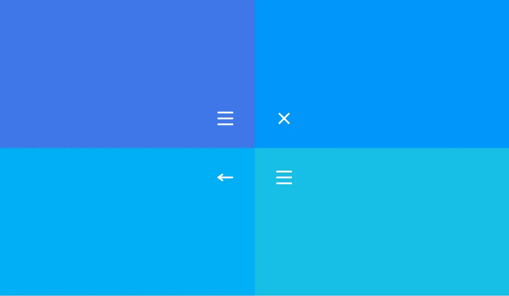
The Wacky Hamburger Menu is a creative and interactive navigation button built with HTML, CSS, and JavaScript. With playful animations and toggling effects, this menu is designed to add personality and fun to your website’s header or sidebar.
Mobile or responsive websites
Creative portfolios and agency sites
Blog or magazine-style navigation
Landing pages with unique branding
Interactive web apps or dashboards
Structure the menu button using three spans inside a clickable container.
Use CSS to style the lines and animate them on toggle.
Apply JavaScript to add/remove classes dynamically on click.
Optional: Integrate the toggle with a sidebar or fullscreen menu.
This UI component blends fun aesthetics with functional design. The animation sequence delivers a surprise element, turning a traditional hamburger icon into an engaging, expressive interaction. Perfect for sites that aim to stand out.
Fully responsive
Works across all major browsers
Easy to customize and integrate
Built with clean HTML, CSS & vanilla JS (no libraries)
Add sound effects on toggle
Include multiple toggle styles (cross, arrow, etc.)
Integrate with a slide-in menu panel
Allow accessibility enhancements (ARIA roles)
Theme variations (dark/light/funky modes)
| Last Update | 09 Sep, 2025 |
| Created | 28 Jul, 2025 |
| Technology Used | HTML CSS JavaScript |
| Compatible With | Any Browser |
| Documentation | No |
| Layout | Responsive |
| Total Download | 9 |
| Total Views | 60 |
| Tags |