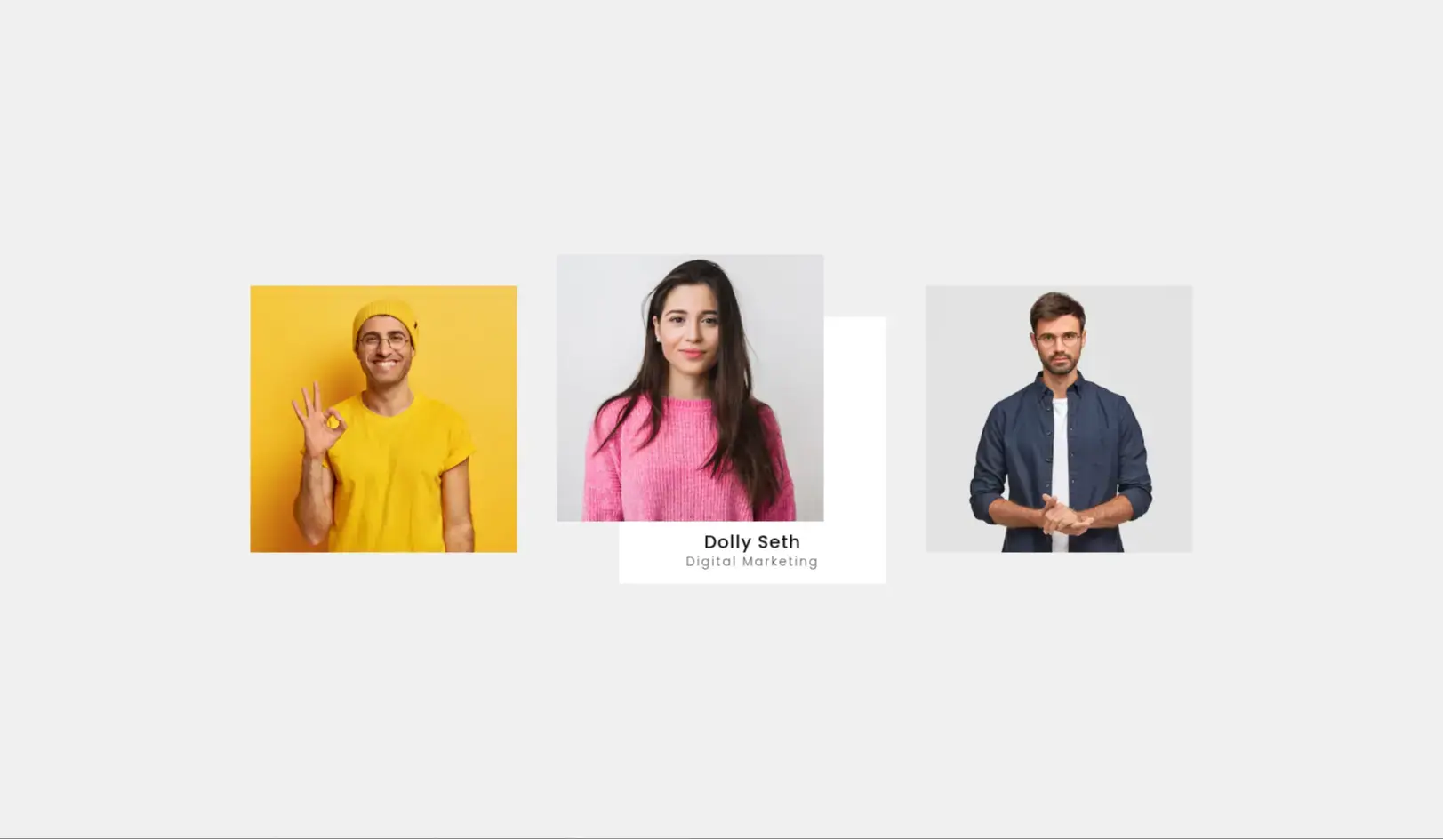
The Card Hover Effect V3 introduces a 3D flip animation that switches between a front and back side on hover. Built with pure HTML and CSS, this card style enhances user engagement and interactivity, allowing for a compact display of content with a hidden backside revealed on interaction.
Product cards showing price or CTA on the back
Team member profiles with contact links or descriptions
Portfolio project thumbnails with detailed summaries
Service highlights on landing pages or homepages
Place the HTML markup containing front and back card content, then apply the CSS with 3D transform and transition rules. When hovered, the card smoothly rotates along the Y-axis (or X-axis if modified), flipping to reveal the backside. Easily customizable for content, color schemes, rotation direction, and card size.
3D card flip using CSS transform and perspective
Clean and responsive layout
Works with just HTML & CSS—no JavaScript needed
Supports images, icons, text, and buttons
Easy to duplicate and scale for grid layouts
V3 of the hover effect prioritizes dimension, motion, and space-saving interactivity. The flip card UI enhances user exploration and makes it easy to present content in a compact and professional way. It’s ideal for both fun and functional UI designs.
✅ Fully compatible with Chrome, Firefox, Safari, and Edge
✅ Works on all screen sizes
✅ Framework-agnostic: Tailwind, Bootstrap, or vanilla CSS
✅ No external JS or plugin dependencies