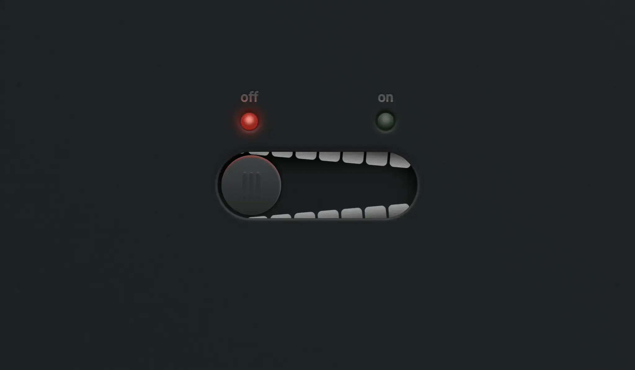
Interactive CSS Clamp Playground – Responsive UI Tool
The Interactive CSS Clamp Playground is a practical and educational web tool built using
HTML, CSS, and vanilla JavaScript. It allows developers to experiment with the CSS
clamp() function in real time, making it easier to create responsive typography and layouts
without complex media queries.
This project focuses on simplifying responsive design by providing a visual interface where users can adjust minimum, preferred, and maximum values dynamically. It is an excellent resource for frontend developers learning modern CSS techniques and building fluid, scalable UI components.
Project Highlights
- Real-time preview of CSS
clamp()values - Interactive sliders to adjust min, preferred, and max values
- Live code output for easy copy and implementation
- Clean and minimal UI focused on usability
- Responsive design for desktop and mobile testing
- Lightweight implementation with no external libraries
- Helps visualize fluid typography and spacing
- Instant feedback for faster design decisions
Use Cases
- Responsive typography design using CSS clamp
- UI/UX experimentation for fluid layouts
- Frontend learning and CSS education tools
- Design systems requiring scalable spacing and sizing
- Developer utilities for generating CSS values
- Portfolio projects showcasing practical tools
Technology Stack
- HTML5 for structure and layout
- CSS3 for styling and responsive visualization
- JavaScript (ES6+) for real-time calculations and updates
- CSS clamp() function for fluid responsiveness
- Flexbox/Grid for layout alignment
Additional Features & Tips
- Add unit selection (px, rem, vw) for flexibility
- Include preset templates for quick testing
- Provide copy-to-clipboard functionality for generated code
- Display visual graphs for better understanding of scaling
- Support multiple elements like font-size, padding, margin
- Add dark/light mode for improved usability
- Store user settings using local storage
- Integrate with design systems for consistency
Tip: This project is perfect for developers learning modern responsive design techniques. It helps simplify
the use of CSS clamp() and improves workflow efficiency when building scalable UI systems.
Download is Locked
Please scroll down to view the full page and unlock the download link.
Your Download is Ready
Click the button below to retrieve the project source code.
More Related Items by CodeTap
View All