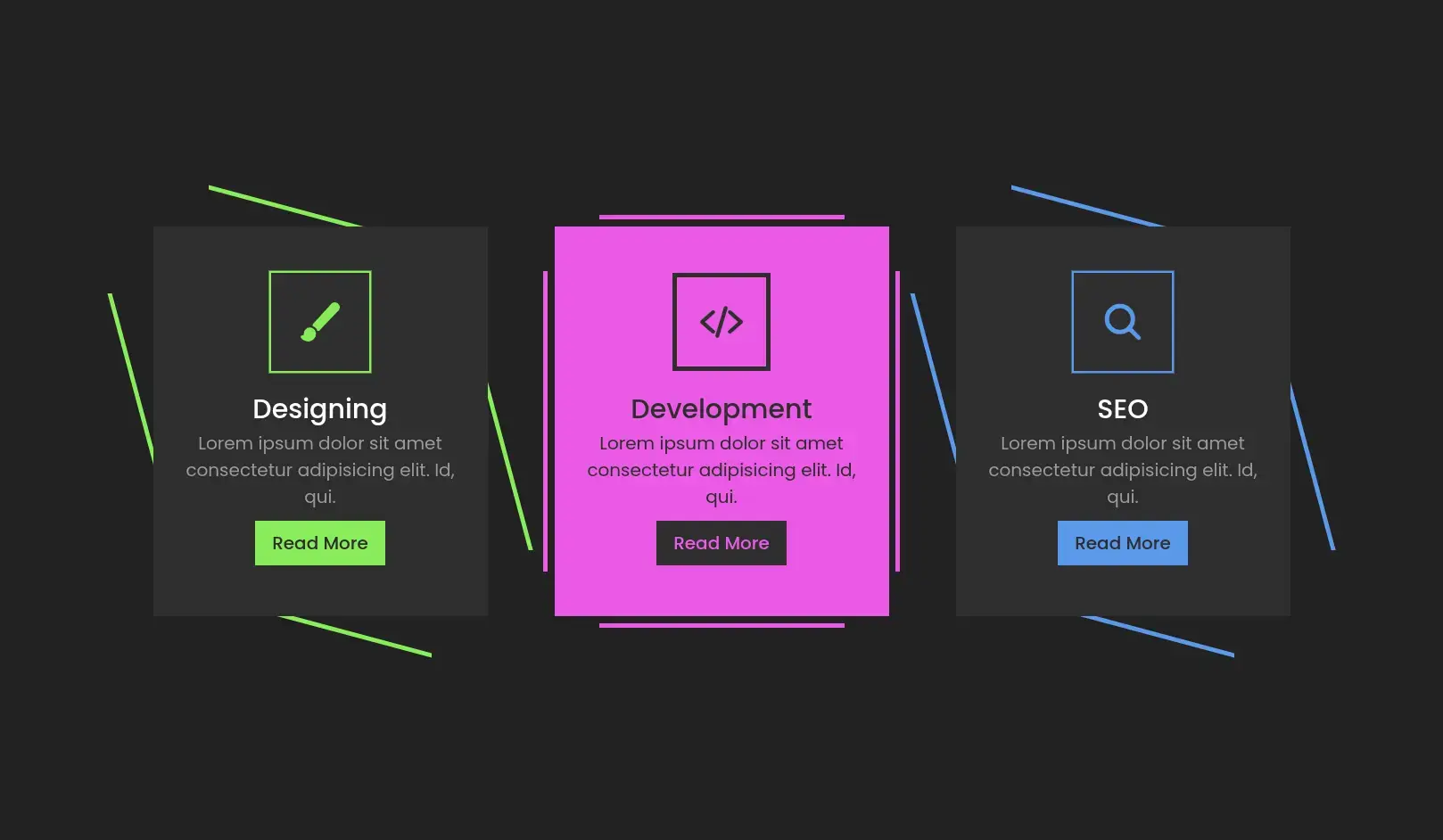
The Responsive Service Section is a mobile-friendly layout built with HTML and CSS, designed to elegantly display multiple service offerings or feature highlights in a clean card-style format.
Service listing on business websites
Portfolio features or offerings
Digital agency service showcase
Startup or product landing pages
Homepage highlights or benefits section
Define a responsive grid container using Flexbox or CSS Grid.
Add service cards with icons, headings, and descriptions.
Use media queries or auto-fit grid to adapt on smaller screens.
Customize with icons, images, or hover effects.
Focused on clarity, readability, and responsiveness, this section ensures content is both attractive and accessible across all screen sizes with no dependencies.
Fully responsive (mobile-first)
All modern browsers supported
No JS required
Easily integratable with any UI framework
Add animations on scroll or hover
Support for dark/light theme toggle
Include icons using FontAwesome or SVG
Convert to a reusable component or Tailwind snippet
Add service link buttons for more interaction
| Last Update | 13 Oct, 2025 |
| Created | 24 Jul, 2025 |
| Technology Used | HTML CSS JavaScript |
| Compatible With | Any Browser |
| Documentation | No |
| Layout | Responsive |
| Total Download | 20 |
| Total Views | 141 |
| Tags |